Input
Course Schedule
6 Fridays, from 10:00–15:00, as well as optional coding consultations from 15:30–17:30. The course takes place in presence, if possible.
| 08.04. | 22.04. | 29.04. | 06.05. | 20.05. | 27.05. | |
|---|---|---|---|---|---|---|
| 10:00–12:00 | Introduction | Input: Form Follows Function → CSS |
Input: The User → CSS / JS |
Input: Redefining Usability → JS |
Input: Accessibility | Collective Coding |
| 13:00–15:00 | Input: Useful Basics → HTML, CSS |
Collective Coding |
Collective Coding |
Collective Coding |
Collective Coding |
Conclusion / Presentation |
| 15:30–17:30 | Coding Consultations [optional] | Coding Consultations [optional] | Coding Consultations [optional] | Coding Consultations [optional] | Coding Consultations [optional] | Coding Consultations [optional] |
Links & Contact
-
The Course-Page
You are here. Here you’ll find the (Un)Usability Glossary and all the inputs.
unusable-websites.katharinanejdl.com -
Discord-Channel
Here you can chat and ask questions.
discord.gg/ARJGw4Z4D4 -
Sign-Up for Coding Consultations [15-17h, optional / on request]
consultations in case you need support with a coding problem or want to talk about your concept a bit longer
GoogleDoc -
Library
a collection of research material
Burg Box -
Contact
Katharina Nejdl
katharina.nejdl@googlemail.com
Where to Start
-
HTML Boilerplate
if you want to start an entry from scratch, start with this empty HTML / CSS / JS files
https://github.com/nejdl/html-boilerplate
[Codesandbox: HTML Boilerplat] -
Starter Kits
if you want to start from modifying existing code, choose one of the coding starter kits
https://github.com/nejdl/unusable-websites_starters
[Codesandbox: Above the fold, (01/HTML)]
[Codesandbox: Frankensteining (02/CSS)]
[Codesandbox: Responsive Design (03/CSS)]
[Codesandbox: Clickability Cue (03/CSS/JS)]
[Codesandbox: Satisfaction (04/JS)]
1. Useful Basic
Course Introduction
Welcome! Check out the course schedule, the about text and the assignment to get started.
Usability History
- Video: The fascinating history of UX design
- Input: Usability History
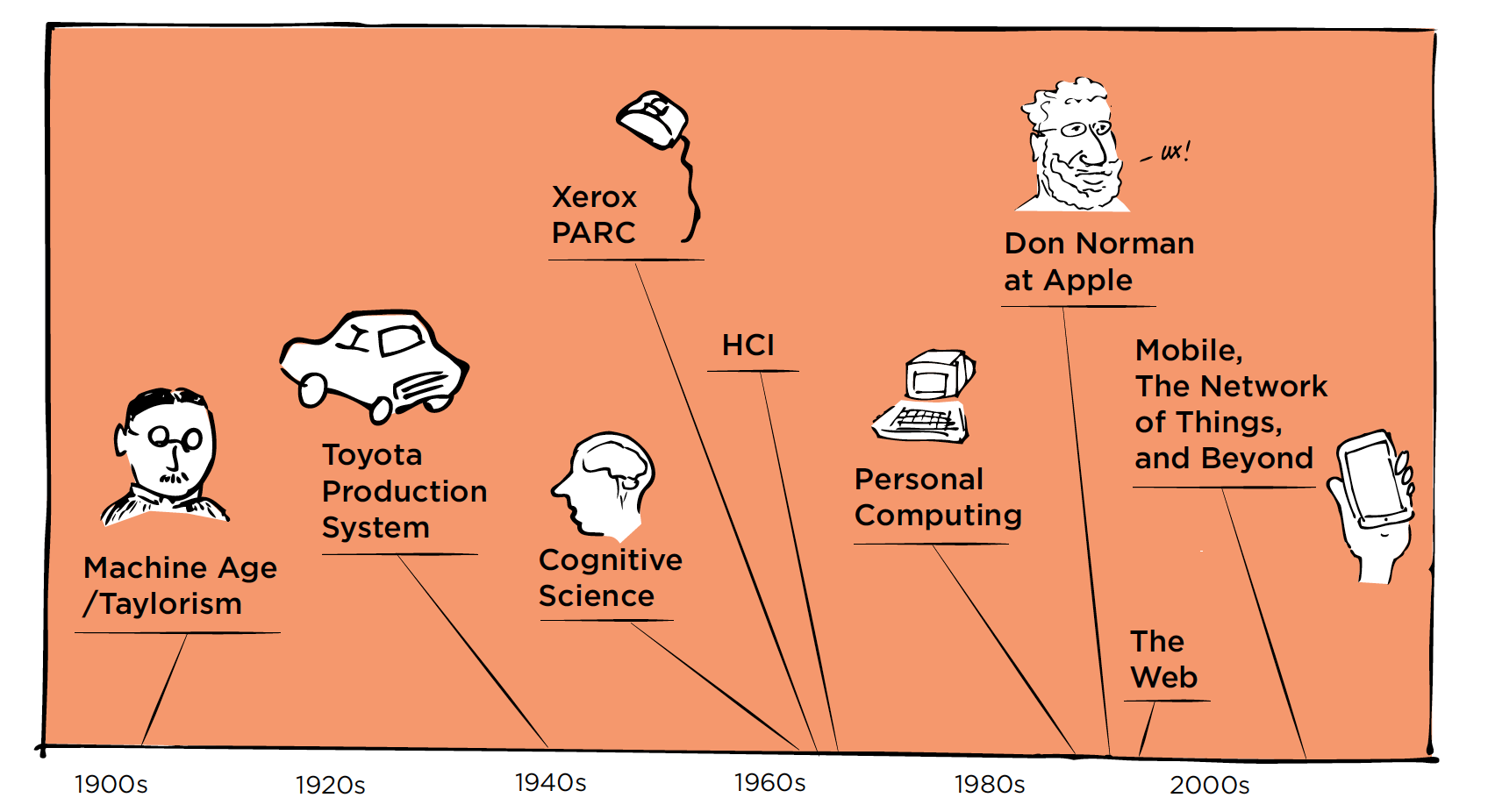 → The User Experience Team of One by Leah Buley - Chapter 1 / p.10-15
Input: Useful Basics → Setup, HTML
- #check-in
- Where to start: starter kits / boilerplate
- TOPIC INTRO
-
Words
-
Above-the-Fold
For webpages, the area that appears in the first screenful when a person loads a page; the part of a web page that can be seen without scrolling.
This is important real estate since users are more likely to spend time viewing these parts while they wait for the remainder of the web page to load and because users often do not scroll down.
Remember that many users will likely have smaller screens than the ones that are being used to develop the website on. [https://www.usabilityfirst.com/glossary/above-the-fold/index.html]Breadcrumbs
A “breadcrumb” (or “breadcrumb trail”) is a type of secondary navigation scheme that reveals the user’s location in a website or Web application. The term comes from the Hansel and Gretel fairy tale in which the two title children drop breadcrumbs to form a trail back to their home. Just like in the tale, breadcrumbs in real-world applications offer users a way to trace the path back to their original landing point. [https://www.smashingmagazine.com/2009/03/breadcrumbs-in-web-design-examples-and-best-practices/]Click-Depth
Number of clicks deep that content is away from the initial homepage.Errors
Human Error: the result of any action whose consequences are not what was intended by the person performing the action. Errors are commonly classified as slips (automatic processes interfering with an action) or mistakes (failures in reasoning or selection of subgoals). Minimization of errors is a frequent design goal and often trades off with the speed at which tasks can be performed.
Computer Error: A situation in which the computer cannot proceed through the normal or expected course of a task because of a bug in the software, an incorrect piece of code that doesn’t properly handle unexpected inputs or performs its calculations incorrectly. In this situation, a system typically produces an error message for the user, and the program may either fail or enter an error-recovery process to enable to continue working despite an individual failed task. [https://www.usabilityfirst.com/glossary/error/] Errors happen and unintended actions are inevitable.
They are a common occurrence in usability tests and are the result of problems in an interface and imperfect human actions. [https://measuringu.com/errors-ux/]Wayfinding
How people orient themselves and navigate in a built environment, both physical and virtual. [https://www.usabilitybok.org/glossary/]
-
-
Reading List
- Podcast: HTML energy
- A Handmade Web – J.R. Carpenter
- Laurel Schwulst’s Decade in Internet – RHIZOME
- EXERCISES
-
Coding Together
- Open the HTML boilerplate.
- Invite someone to code.
- Write a sentence, one word at a time, taking turns.
-
Research HTML Tags
- Go to [W3school: HTML element references].
- Pick one or more HTML tags, look at the documentation and try them out.
- Explain your favorite tag to your neighbour.
BASIC HTML
[CodeAcademy: Learn HTML tutorial][Video: Basics of HTML by Laurel Schwulst]
[References: HTML elements]
[Debugging: HTML validator]
- file setup
- structure: html, body, main, nav, ...
- head (meta, title, css), js
- HTML boilerplate
- syntax
<tag> content </tag>
- hypertext
<a href="http://link.com" target="_blank"> This is the hyperspace. </a>
- tags
- TIPPS
-
Common Mistakes
- unclosed elements
- badly nested elements
- unclosed attributes
- you can check your HTML-code for errors here
- did you save? is your live-server working?
- try inspecting, googling or ask a friend
-
Inspecting
- Open the inspector, by right-clicking on an element, selecting “inspect” / “Untersuchen“ or ALT + CMD + I.
- Inspect the elements, change content, delete tags, try out styles. Changes will not be saved, therefore it’s great for trying out and debugging.
- Open the inspector, by right-clicking on an element, selecting “inspect” / “Untersuchen“ or ALT + CMD + I.
2. Form Follows Function
Input: Form Follows Function → CSS
- #check-in
- Where to start: starter kits / boilerplate
- Input: Form follows function?
- TOPIC INTRO
-
Words
-
Memorability
The degree to which users can remember how to use an interface. [https://www.usability.gov/what-and-why/glossary/m]Negative space
The space surrounding foreground elements; the background or whitespace. In graphic design theory, the shape of the negative space needs to be aesthetically pleasing to form a balanced composition. In certain types of layouts, the negative space may be just as important to conveying meaning as the figure or foreground element. [https://www.usabilityfirst.com/glossary/negative-space/]Readability
How easy or difficult it is to read a collection of words in a specific type style. [https://www.usability.gov/what-and-why/glossary/r] Readability is the degree to which the meaning of text is accessible, based on the complexity of sentences and the difficulty of the vocabulary that is used. Readability indexes usually rank usability by the age or grade level required for someone to be able to readily understand a reading passage. Note that readability should be contrasted with legibility, which indicates how clear the text is visually. [https://www.usabilityfirst.com/glossary/readability/] Legibility is the clarity of visually-presented text, affected for instance by the size of the text, the contrast between similar letters, the quality of printing or display (whether the text is damaged or blurred), the line-spacing and word-spacing, and the shape and style of individual letters. Legibility is distinct from “readability”, which indicates how easy it is to understand the text, provided that it can be read. [https://www.usabilityfirst.com/glossary/legibility/]Similarity
Perception that elements of the same size, shape or color belong together. [https://www.usability.gov/what-and-why/glossary/s/]Simplicity
Interfaces should not contain information which is irrelevant or rarely needed. Every extra unit of information in an interface competes with the relevant units of information and diminishes their relative visibility.
This heuristic doesn't mean you have to use a flat design — it's about making sure you're keeping the content and visual design focused on the essentials. Ensure that the visual elements of the interface support the user's primary goals.- Keep the content and visual design of UI focus on the essentials.
- Don't let unnecessary elements distract users from the information they really need.
- Prioritize the content and features to support primary goals
[see https://www.nngroup.com/videos/aesthetic-and-minimalist-design/]Frankensteining
The merger of multiple designs into one despite the fact that they don’t form a coherent, consistent whole. A typical situation is to present multiple design options to a client who asks for a piecemeal combination of features. While the original designs each conveyed a unified message, the combination is a monstrous hodge-podge. [https://www.usabilityfirst.com/glossary/frankensteining/]
-
-
Reading List
- Form Follows Function? – Smashing Magazine
- The Demise of “Form Follows Function“ – NY Times
- Video: It’s not you. Bad doors are everywhere.
- EXERCISES
-
Inspecting
- Open any website, e.g. the last website in your browser history.
- Open the inspector (right-click “inspect” / “Untersuchen”) and view the elements.
- Change something and show it to your neighbour (e.g. delete the advertisement, change the title or some styling attributes).
-
Research CSS Properties
- Go to [CSS-TRICKS: CSS Properties].
- Pick one or more CSS properties, look at the documentation and try them out.
- Explain your favorite property to your neighbour.
BASIC CSS
[CodeAcademy: Learn CSS tutorial][Video: Basics of CSS by Laurel Schwulst]
[References: CSS properties]
[References: CSS selector tester]
[Debugging: CSS validator]
- HTML Recap
- syntax
                        div {

                          color: red;

} - where?
- inline
- inside style tag
- external css file
- .classes & #ids
<div id="subtitle" class="text"> Some content inside. </div>
- properties
- TIPPS
-
Common Mistakes
- forgot colon : after css property, semicolon ; at end of line or closing curly bracket }
- spelling mistake in property / attribute
(e.g. colour instead of color ) - wrong selector (e.g. .container instead of #container)
- you can check your CSS-code for errors here
- did you save? is your live-server working?
- try inspecting, googling or ask a friend
-
Borders / Background-color
- Can you tell what size your elements take up? Guess.
- Give all items borders.
                            * {

                              borders: 1px solid black;

} - Give your elements different background-colors to differentiate them.
                            div {

                              background-color: red;

} - How good was your guess?
-
Design first, style later
Designing right in the code editor with CSS-styles can be fun and inspiring. But you’re likely going to try out 10 different things without making a design decision. If that frustrates you, it can help to separate design (the look) from styling (the code):- Design in Figma / Sketch / Adobe XD / on paper first.
- Then build your HTML structure, without any styling.
- Once the functionality is finished, you can can style your elements / implement your design much easier and more straightforward.
Collective Coding
- #check-in
- Where to start: starter kits / boilerplate
- Coding consultations: sign-up [optional, 15-17h]
- EXERCISE
-
Frustration Management
- Write down three things that help you deal with frustration on post-its.
- Hang it on the wall.
- Next time you feel frustrated, look at the wall and follow one of the tips.
3. The User
Input: The User → CSS / JS
- #check-in
- Where to start: starter kits / boilerplate
- TOPIC INTRO
-
Words
-
Browser / Device Compatibility
The ability of an Internet browser to properly interpret the code that makes up web pages since there is slight variation between each. [https://www.usability.gov/what-and-why/glossary/b/index.html]Individual Differences
People vary in a number of ways that can have an impact on the design of a user interface, and rather than trying to design for “the average user”, it is often better to understand how people vary to design acceptably for a broad audience. Sometimes this may even mean designing separate user interfaces for different user populations, such as when extremely simplified drawing programs are made for young children versus sophisticated versions designed for graphic design professionals.
Some of the main categories of variations that are of interest to designers are:- user experience level – how well users know their subject domain, computing skills, internet skills, …
- user preferences – users will choose settings according to their own tastes and work practices
- market segment – such as age, gender, education, occupation, hobby, and income level
- variation in ability – users often have relevant physical or cognitive limitations; for instance, near-sightedness and color blindness are extremely common, and these can usually be easily addressed when a designer is aware of the issues
Interactivity Cues
Cues indicate available interactivity such as hover states, clickability or scroll cues.
Hover states are initiated by the user pausing over an interactive element using a cursor. They can be applied to all interactive components, and should be deemphasized to avoid distracting from content. An overlay signifies a hover state. [https://material.io/design/interaction/states.html#hover] A clickability cue is a visual indication that a given word or item on a web page is clickable. Cues that can be used to indicate the clickability of an item include color, underlining, bullets, and arrows. [https://www.usability.gov/what-and-why/glossary/c/] An arrow or a text can serve as scroll cues, indicating that there is more content below-the-fold that can be scrolled into view.Mystery Meat
An interaction pattern that is unclear in what will happen once you click on it. Examples are hamburger menus and other navigation items that use an icon without a label. [https://exclusive-design.vasilis.nl/thesaurus]Responsive Design
A web design approach aimed at crafting sites to provide an optimal viewing experience across platforms and devices. [https://www.usability.gov/what-and-why/glossary/r]2-Second Rule
A generally acceptable amount of time for a user to wait for certain system responses such as an application launch or switch. [https://www.usability.gov/what-and-why/glossary/tag/interaction-design]
-
-
Reading List
- Painting with Pure CSS – on browser (un-)compatibility
- The User Condition – Silvio Lorusso
- The Promise of Empathy – Design, Disability, and Knowing the “Other“
- EXERCISES
-
A user survey
- How much can we ask of the user? And what do they ask of us?
- What is the role of the user? Are they only passive-readers or can they influence the text / elements? Do they even create or decide something?
- Can a technology stop to serve its users by working *too well*? Or, conversely, can the value of a technology lie in the fact that it is *not* perfectly efficient? [see The User Condition by Silvio Lorusso]
- What is your user-experience? What are your experiences as users?
- What’s the relationship between designer / coder and user?
- Who is your website for? Who uses your website? Who couldn’t or wouldn’t want to use your website?
- Is there the user? Or are there only people in front of screens?
INTERMEDIATE CSS
[References: A guide to flexbox][Game: Flexbox froggy]
[CodeAcademy: Learn indermediate CSS]
- HTML / CSS Recap
- media queries
when the browser is smaller than 800px (mobile / tablet):
.element {
font-size: 18px;
}
}
.element {
font-size: 25px;
}
}@media (hover: none){
.element:hover {
color: inherit;
}
} - advanced positioning
- flex-box
[Video: CSS Flexbox in 100 Seconds]
[Reference: A Complete Guide to Flexbox] - css-grid
[Video: Build a Classic Layout FAST in CSS Grid]
[Reference: A Complete Guide to Grid]
- flex-box
- css-variables
                        :root {

                          --gapS: 5px;

                          --gapM: 10px;

                          --gapL: 20px;


                          --highlightColor: #0000FF;

                        }


                        .element{

                          color: var(--highlightColor);

                          margin: var(--gapS);

} - display
display: block;
}
.hidden {
display: none;
} - transformation
                        .element {

                            transform: translate(50%, 50%);

                        }
.element {
transform: translate(50%, 50%) rotateX(-12deg);
} - transition & animation
                        .element {

                            width: 200px;

                            transition: width 0.3s ease;

                        }


                        .element:hover {

                            width: 500px;

                        }
width: 200px;
color: red;
transition: width 0.3s, color 0.5s;
}
.element:hover {
width: 500px;
color: blue;
}
BASIC JS
[References: JS intro][CodeAcademy: Introduction to Javascript]
- where?
- inline
- inside script tag
- external js file
- logging
console.log('hi');
- variables
modern JS: const / let
                        const message = 'hello';

                        console.log(message);
console.log(counter);
counter = counter + 1;
console.log(counter);var message = 'hello';
console.log(message);
var counter = 1;
console.log(counter);
counter = counter + 1;
console.log(counter); - data types
const string = '1';
const boolean = false;
- get elements by Id / className / ...
                        const logo = document.getElementById('logo');

const text = document.getElementsByClassName('text')[0]; - change style / class with JS
change style in JS:
logo.style.backgroundColor = 'blue';
logo.classList.add('hidden');let root = document.documentElement;
root.style.setProperty('--highlightColor', 'red'); - timeout function
                        setTimeout(function(){

                            console.log('Finally here!');

}, 500); - innerHTML
                        const heading = document.getElementById('heading');


heading.innerHTML = 'New Heading'; - eventListener: CLICK
in JS:
logo.addEventListener('click', function(){
console.log('the user clicked on the logo');
})
<button onclick="myFunction()"> Click me! </button> - eventListener: MOUSEMOVE / TOUCHMOVE
mousemove (desktop):
document.body.addEventListener('mousemove', function(e){
const mouseX = e.clientX;
const mouseY = e.clientY;
console.log(mouseX, mouseY);
circle.style.top = mouseX + 'px';
circle.style.left = mouseY + 'px';
})
document.body.addEventListener('touchmove', function(e){
const touch = e.touches[0];
const touchX = touch.clientX;
const touchY = touch.clientY;
console.log(touchX, touchY);
circle.style.top = touchX + 'px';
circle.style.left = touchY + 'px';
})const root = document.documentElement;
document.body.addEventListener("mousemove", e => {
root.style.setProperty('--mouse-x', e.clientX + 'px');
root.style.setProperty('--mouse-y', e.clientY + 'px');
});
- TIPPS
-
Debugging friends
- Is your syntax correct? Check your browser’s console.
- Error messages are your friends. Read them carefully, because usually they tell you where the problem is.
- The console.log() is your friend. Log everything to make sure you have the right element / value / etc.
- Try to run your code step by step (optimally logging all of them), to make sure things you think are working are actually working and to isolate the bug.
- Did you save? Is your live-server working?
- Try inspecting, googling or ask a friend.
-
Different devices
How does your website look on mobile?-
Inspect your website in different device widths, via the device toolbar.
- Or find out your IP-address and port of your localhost and open the website on your mobile device.
-
Inspect your website in different device widths, via the device toolbar.
Collective Coding
- #check-in
- Where to start: starter kits / boilerplate
- Coding consultations: sign-up [optional, 15-17h]
- EXERCISE
-
One sentence concept
- Pick a glossary term.
- Think of an interaction concept for the term.
- You can sketch wireframes on paper.
- Now write the concept down in one sentence.
4. Redefining Usability
Input: Redefining Usability → JS
- #check-in
- Where to start: starter kits / boilerplate
- Input: Why do all websites look the same?
- Input: Queer Use by Sara Ahmed
- TOPIC INTRO
-
Words
-
Affective Interface
A user interface that appeals to the emotional state of users and allows users to express themselves emotionally. [https://www.usabilityfirst.com/glossary/affective-interface/] How does it make the users feel? Does it make the user happy? What aspects of the experience make users happy, what puts them in a good mood, and what sustains their positive engagement or 'joy of use’? [https://www.experiencedynamics.com/training/seminars/pleasurability-designing-emotion]Convenience
The degree to which accessing and using an interface is comfortable, and possible without excessive effort, mental or physical. The lack of deterrents to use, including organizational and social deterrents, schedule constraints, system availability, learning threshold, system delays, and prerequisites for use. [https://www.usabilityfirst.com/glossary/convenience] Can a technology stop to serve its users by working too well? Or, conversely, can the value of a technology lie in the fact that it is not perfectly efficient? When it comes to convenience, whose convenience are we talking about? [workshop description by Silvio Lorusso; see his essay on (mis)convenience https://theusercondition.computer]Effectiveness
The degree to which an interface facilitates a user in accomplishing the task for which it was intended. This normally refers to the degree to which errors are avoided and tasks are successful, measure by “success rate” or “task completion rate”. Conversely, a measure of “error rate” is the number of errors made, and when used to guide design, those errors would often be categorized by cause. [https://www.usabilityfirst.com/glossary/effectiveness] The attribute of usability that focuses on task completion, guiding the user through all parts of the task and ensuring that the task is properly completed. [https://www.usabilitybok.org/glossary]Efficiency
The attribute of usability that focuses on being able to accomplish a task in minimum time with a minimum of effort. [https://www.usabilitybok.org/glossary] The rate or speed at which an interface enables a user to accurately and successfully complete a task. While faster response time is usually better, consistent response time is also important. [https://www.usabilityfirst.com/glossary/efficiency]Satisfaction
A common reference to the set of subjective responses a person has when using a system. Typically satisfaction is measured with questions that have their responses on Likert scales, e.g. “How satisfied are you with this software? (1 – very dissatisfied, 7 – very satisfied)”. [https://www.usabilityfirst.com/glossary]Familiarity
The degree to which a user recognizes user interface components and views their interaction as natural; the similarity of the interface to concrete objects the user has interacted with in the past. User interfaces can be familiar by mimicking the visual appearance of real-world objects (see skeuomorphism), by relying on standardized commands, or by following other common metaphors. [https://www.usabilityfirst.com/glossary/familiarity/] Skeuomorphic is the technical term for incorporating old, familiar ideas into new technologies, even though they no longer play a functional role. [https://uxdesign.cc/the-power-of-familiarity-in-design-skeuomorphic-triggers-and-personified-machines-7fb66ba8bf98]Erwartungskonformität
Die Erwartungskonformität beschreibt, inwiefern die Interaktion mit einem Produkt das widerspiegelt, was der Nutzer erwartet hat. Geschieht etwas nicht nach der Vorstellung des Nutzers, ist er überrascht. Im schlimmsten Fall macht er Fehler, die nicht mehr rückgängig gemacht werden können. [https://www.usability.de/usability-user-experience/glossar/erwartungskonformitaet]
see also: [https://de.wikipedia.org/wiki/Erwartungskonformit%C3%A4t]
-
-
Reading List
- → What’s the Use? by Sara Ahmed
- Why do all websites look the same? – Boris Müller
- Video: How dark patterns trick you online
- The User Condition – Silvio Lorusso
- → Aaron Walter: Designing for Emotion
- EXERCISE
-
Coding without coding
- What are you trying to code?
- Can you break down the functionality you want to code in smaller parts? Try to dissect your functionality into all the small steps you’ll need to do – as if you were writing your javascript code in plain language.
- Write each step down (on paper / in your editor) before you start coding.
Intermediate JS
[References: JS Guide][CodeAcademy: Learn intermediate kavascript]
- functions
console.log('Hello World!');
}
logHello();function logSomething(params) {
console.log(params);
}
logSomething('Ciao World!'); - if / else
if(number < 5){
console.log('smaller than five');
} if else (number === 5) {
console.log('equals five');
} else {
console.log('higher than five or undefined');
} - arrays
                        const fruits = ['banana', 'apple', 'pear'];

                        console.log(fruits[0]);
const textElements = document.getElementsByClassName('text');
console.log(textElements[0]); - for loops
- for loop
                            for (i = 0; i < 10; i++) {

                                // do something

                            }
const fruits = ['banana', 'apple', 'pear'];
for (i = 0; i < fruits.length; i++) {
const fruit = fruits[i];
console.log(i);
console.log(fruit);
} - for...of loop
                            const fruits = ['banana', 'apple', 'pear'];


                            for (const fruit of fruits) {

                                console.log(fruit);

                            }
[Reference: for...of vs. for-loop]
[Reference: forEach vs. for...in vs. for-loop] - for loop
- objects
const person = {
firstName: "Jane",
lastName: "Doe",
age: 25,
eyeColor: "brown"
}; console.log(person.firstName); - JS libraries
- TIPPS
-
Debugging friends
- Is your syntax correct? Check your browser’s console.
- Error messages are your friends. Read them carefully, because usually they tell you where the problem is.
- The console.log() is your friend. Log everything to make sure you have the right element / value / etc.
- Try to run your code step by step (optimally logging all of them), to make sure things you think are working are actually working and to isolate the bug.
- Did you save? Is your live-server working?
- Try inspecting, googling or ask a friend.
-
Workflow
What is your workflow? Do you work in a group or alone? Do you separate steps or do everything at once?
Here’s an example of my workflow:- concept
- sketch / wireframe
- functional prototype
- design
- style
- test
Collective Coding
- #check-in
- Where to start: starter kits / boilerplate
- Coding consultations: sign-up [optional, 15-17h]
- EXERCISE
-
Testing
Here are some ways to test the usability of your website:- Let your neighbour use your website and watch how they use it / how much they understand – without you explaining.
- Test your website on different devices (Mac, Windows, Android, iPhone), different widths and browsers (Safari, Chrome, Firefox, Edge) and document the bugs.
- Ask 5 people (with different digital literacy / abilites / devices / browsers) to test your website and write down the bug report in a GoogleDoc.
- TIPP
-
How to document bugs
If you ask someone to go bughunting, ask them to document bugs with – so you can recreate it on your own device or on Browserstack.- description
- screenshot
- name / contact
- browser / device
5. Accessibility
Input: Web Accessibility
- #check-in
- Where to start: starter kits / boilerplate
- Input: W3C: Introduction to Web Accessibility
- TOPIC INTRO
-
Words
-
Accessibility
Accessibility tries to eliminate barriers in information technology, to make available new opportunities for people with disabilities. [https://www.usability.gov/what-and-why/glossary] The attributes and characteristics of a system that allow people with limited vision, hearing, dexterity, cognition or physical mobility to interact effectively with the system. Standards and guidelines are available, and standards may be legally enforced in some markets. Accessibility aids, such as screen readers, may be added to a system to allow people with disabilities to use those systems. [https://www.usabilitybok.org/glossary]Assistant / Wizard
A special type of dialog box that takes a user through a step-by-step procedure. Intended to simplify what might otherwise be a more complex procedure if performed, for instance, through direct manipulation.
“Assistant” is the term used in the Mac OS. “Wizard” is the term used in Windows. Assistants were also used in software interfaces, such as Microsoft Office’s “Clippy”. [https://www.usabilityfirst.com/glossary/assistant-wizard/]Internationalization
A system whose primary design has been developed to work in multiple languages and in the cultural contexts of different locales. [https://www.usability.gov/what-and-why/glossary/i]Seizure Disorder
In some types of epilepsy, a seizure can result from the presentation of a rapidly-varying stimulus, such as flashing lights and repetitive sounds. Thus, interfaces should avoid strobe effects, blinking effects, and repetitive noises.
In most interfaces, these are likely to annoy almost any user, but in the instances when such effects may be appropriate or useful to the target users, a warning should be provided, along with a way to disable the feature. The exact conditions that trigger seizure may vary, so it’s even better to provide ways to disable all repeating audio or animation or to control the speed of the animations. [https://www.usabilityfirst.com/glossary/seizure-disorder]Usability Evaluation
Assessing the usability of a product with the purpose of identifying usability problems and/or obtaining usability measures. The purpose of evaluation can be to improve the usability of the product as part of design/development (formative evaluation), or to assess the extent to which usability objectives have been achieved (summative evaluation). [https://www.usabilitybok.org/usability-evaluation-methods]
-
-
Resource List
- Readings
- Exclusive Design – Vasilis van Gemert
- All Technology is Assistive Wired
- Online Courses on Web Accesibility
- Introduction to Web Accessibility
what is web accesibility and why is it important - Web Accessibility
how to code accessible sites
- Browser Tools to Analyse Accesibility
- Accessibility Inspector – Firefox
- Lighthouse – Chrome
- Guidelines
- A First Review of Web Accessibility – W3C / WAI
- WCAG Guidelines
- BITV-Test
- EXERCISE
-
Make your website more accessible, one step at a time
- Anaylse your website for accessibility (e.g. with Firefox’s Accessibility Inspector or Chrome’s Lighthouse.
- Read through the accessibility analysis.
- Make one aspect more accessible.
Collective Coding
- #check-in
- Where to start: starter kits / boilerplate
- Coding consultations: sign-up [optional, 15-17h]
6. A Glossary
Collective Coding
- #check-in
- Where to start: starter kits / boilerplate
- Coding consultations: sign-up [optional, 15-17h]
- TIPP
-
Relative / Absolute Paths
If you upload your website to a subfolder, make sure you use relative file paths in your HTML.
<link rel="stylesheet" href="./css/style.css" </>
[https://www.w3schools.com/html/html_filepaths.asp]
[Absolute / Relative Paths]
- EXERCISE
-
Uploading
Let’s upload our glossary entries!- Upload.
- Test.
- Fix bugs.
- Reupload.
Presentations / Conclusion
The plan for this session:- Uploading
- Presenting the entries
- Usability Conclusions
- Course Feedback
- (Präsentation der Wahlpflichtkurse)